

MIRROR: Redesign a Website - Mobile
PROBLEM
Mirror is a popular clothing store franchise that has been newly rebranded. However, a mobile version of this website is now needed in order to make it accessible to mobile users.
BACKGROUND
Mirror was founded in 1994 as a clothing store and offer affordable clothing options. They have been successful with their business with over 400 stores in the world in 32 different countries. Their values are based on being budget-friendly and inexpensive, while being flexible with various amounts of styles at the same time.
SOLUTION
To create an accessible mobile version of the Mirror website, much like the desktop version.
Main Takeaways:
I wanted to make sure to incorporate user interviews as a form of research. I believed that this would get me closer to my goals of making Mirror more accessible to those who shop on mobile.
From these notes, I can confirm that accessibility and the use of promotions are key- along with navigation for this clothing site, especially since they have a variety of clothes. In this interview, these users wanted to give me their ideal mobile site. I kept these in mind while also keeping the traits of other sites that are successful!
USER INTERVIEW
May I have your name/gender (& pronouns)/age/occupation?
Person 1: 22 years old
Person 2: 34 years old
Person 3: 29 years old
Person 1: Male (he/his)
Person 2: Female (she/her)
Person 3: Male (he/him)
Person 1: Student
Person 2: Business Analyst
Person 3: DevOps Engineer
Why do you shop online on mobile?
Person 1: “I shop for clothes on mobile because it is extremely convenient for me. I’m a student and I feel like it is quite typical being in GenZ to always be on my phone, so here I am shopping on my phone all the time. Also I just like to keep my browsing online separate from my studies, so I would not want to use my laptop for school to be mixed with shopping as it can be pretty tempting.”
Person 2: “I love shopping on my phone honestly. I used to not use my phone so much for anything but texting, but with the pandemic I was on my phone a lot more as there was nothing to do a lot of the times during my down times. And I guess it grew on me? I’m addicted to my phone now… can’t say if it’s good or bad or whatever. It is so easy to use your fingers and tap away until you buy everything. Love it!”
Person 3: “Shopping for clothes online is easy. I don’t have a personal laptop, only a work laptop and then I have a PC for gaming and personal use. So it’s not like you can take your PC everywhere or anywhere at all. My PC is built in a table, you know those ones? So basically while I like being out and about, I hate shopping in person. Also, Covid. I can’t take my PC so I only really have my phone. I would always mindlessly be browsing for clothes on my phone all the time, it’s really convenient.”
Do you prefer to shop online on mobile? Why or why not?
Person 1: “I think I would pick mobile. I feel like it’s more reliable for some reason. It’s simple too.”
Person 2: “It’s a 50/50 for me, I can’t say. I like being on my desktop and I like mobile. Sorry I don’t have much of an answer for this on the spot!”
Person 3: “Definitely mobile! It’s easy, less work to move your eyes around and all that. Also what I said before with it being the only thing I use, and I’m not glued to my PC all the time”
What makes it better to shop on mobile than shopping on desktop?
Person 1: “It’s so portable! Take it anywhere you go, you always have access”
Person 2: “I really like how I don’t have to do much; moving a mouse and clicking is slower for me to be honest”
Person 3: “Same answer as before! I can’t think of anything else”
What makes it better to shop on desktop than shopping on mobile?
Person 1: “I do like how the images are bigger and it’s just easier to see pictures clearly”
Person 2: “I don’t know if this is something on mobile but I love the quick look option for desktops!”
Person 3: “I’d have to say there are more options on the screen of a desktop.”
What is something you would change with a clothing store that you have shopped on mobile for/would like to see more often?
Person 1: “Sometimes it’s so bunched up, like the images and videos. I’d rather have it simple and easy to use”
Person 2: “I would like to see it being easier to make sure promotions are emphasized! I love discounts and promotions… and who doesn’t?”
Person 3: “I like the endless scrolling option where you can just scroll instead of always having to press ‘next page’ because I don’t like to stop and have to find that button. Easier to just scroll constantly. I forgot which website does that but I’m pretty sure that exists”
Is there any more information that you would like to share regarding your shopping experiences on mobile?
Person 1: “Having it organized and not so complex with design is so much better if that helps!”
Person: 2: “Making it an easier time to add to cart and purchase. Also just not have to press too many buttons?”
Person 3: “Just emphasis on the endless scrolling. Would be top tier to have. Otherwise nope!”
COMPETITIVE ANALYSIS
I analyzed 4 commonly known websites in order to make comparisons of what they have featured on their sites, which most likely would be part of why they are so successful online as well as they are in stores (with the exception of Etsy- this is purely an online business comprised of small businesses selling on this site). I found that their navigation was to the point, which is what I planned on incorporating in Mirror’s mobile website.

USER PERSONA
I also created a persona based on a survey I created that was taken by a 22yo, 34yo, and 29yo regarding their shopping habits on their phones. These users told me that this would be great for those who are just starting their careers, while also relatable to college students considering most Gen-Z/Millennials are typically using their phones. 98% of Gen-Z uses a phone. This further developed more in-depth knowledge of what a user would be looking for and not looking for.

WIREFRAMES
Then I started to create wireframes- this was definitely influenced by H&M and other online clothing stores as well. This pattern is the kind of consistency a lot of other store brands have on their sites, so I wanted to make sure that users will feel familiarity when navigating and purchasing on Mirror.
For example, normally the featured items or collections would be one of the first items on the homepage, which is what I believe Mirror should have as well for their users to interact with those collections more.

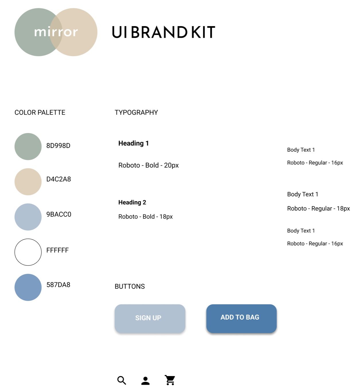
UI BRAND KIT
Onto the brand kit, which was something I enjoyed creating the most! Since I did already create a brand kit for the desktop website itself, I ended up using most of everything and adjusted it to the mobile version’s needs.
The thought process for this brand kit was to have a mixture of soft, muted earth tones. Blue/cool colors tend to make users calmer just like most organizations/companies use to create relaxation throughout their process of navigating throughout the site.
HI-FIDELITY PROTOTYPE V1
I had the users explore their way around this prototype to make sure I can catch something that might have been missing. I also assigned them a task, using their mouse to hover where they would go acting as if they had a phone in their hand, and how they would navigate in order to complete this task.
This specific task required finding “Sully’s Pelt”, and adding it to cart.
So far, it did work out great for the most part!


AFFINITY MAP
In order to get my feedback with the user testers, I asked them what successes, pain points and suggestions/feedback they wanted to bring to my attention. To organize this, I used an Affinity Map. This made it so much simpler to look at and break down what I would need to incorporate immediately, and what have been successes that I would want to keep for this site.

Person 1 (blue): 22yo
Person 2. (pink): 34yo
Person 3 (green): 29yo
It looked like the ones that needed attention the most according to the majority was the “Shop Now” CTA being visible, and to display how users know something is selected. Now, onto the final version!
HI-FI PROTOTYPE: FINAL VERSION
After studying some of the feedback the users gave me, I incorporated some edits that would make the user experience that much more accessible, and aesthetically pleasing to use. I wanted to make sure this site as a whole would be great for both desktop and mobile.
One example is that I made sure the CTA were all darker, since the user testers have mentioned this a couple times. This way, the CTA will be visible enough, while also not taking away from the aesthetic of the website’s color palette. I made sure to follow closely with the color palette so it would not stand out oddly. I went back and incorporated this into the desktop version as well!
Also, while using a feedback from one of the users, I was doing some more looking back on Home Depot and I noticed that they use orange (a huge part of their color palette) to highlight certain text. These changes overall will make CTAs more visible to the eye while also fitting the color palette. I also included this in the desktop version so everything would be consistent with each other.
BEFORE

AFTER


CONCLUSION
All in all, I believe this mobile version was a success! I was able to not only maximize the best experience for users, but also be able to go back and incorporate this into the desktop version that I created as well. This was definitely a unique process, as organizing the mobile version would be formatted somewhat differently than a desktop.