VENMO: Adding a Feature
Problem
Venmo is one of the greatest apps to make transactions with. However, people would typically be complaining about how there is only so much they can do if they request payment and the other person either forgets or ignores it. And in my experience, it can be a huge pain point as many people who use Venmo rely on receiving what they charged others. If you may not see them again or do not keep in close contact aside from getting their Venmo username, how will the be able to be notified and reminded to pay?
Background
Venmo was founded in 2009 by Andrew Kortina & Iqram Magdon-Ismail, which allows users to make payments as well as request payments with friends, family, and anyone else that has this app. It is used for both personal and business use.
GOAL
My goal for this app is to add in a social feature besides being able to comment on your own transactions and other's transactions. I want to make it so that this feature would be a chat feature where in case of a group payment situation or an individual is forgetful about the notification they get regarding a request of payment, they would be notified as many times as the person requesting wants to notify them by using a notification button reminder that is accessible in the chatroom as well as simply sending messages of reminders manually in the chat room.
COMPETITIVE ANALYSIS
I have compared 3 different direct competitors (Cash App, Zelle, PayPal) along with 1 indirect competitor (Klarna). These were the perfect brands to analyze, since they are all widely popular and used (either nationwide or worldwide). I have discovered that none of these have the ability to communicate so much, especially since sending money can be so risky when you do not know the person well enough.
Cash App, Zelle, and PayPal are all used to pay businesses and specifically other users on their personal bank accounts. Klarna is mainly used for payments: payment plans instead of paying in full.
USER PERSONA
I created a persona, Matthew Wright, who wants to ensure they can receive their payments in the quickest, most efficient way. From my findings according to other users, it can be quite tedious and awkward not being able to contact people or remind them to complete a transaction. Typically, the audience is mostly young adults to teens who use these features, as no one carries cash anymore or go to ATMs nowadays.
SKETCH/WIREFRAMES
After creating the persona, I moved onto sketching out what I believe would look best for this app. I wanted it to be clear that this feature is a chat feature- something that would look very similar to other social media chat rooms.
LOW FIDELITY PROTOTYPE
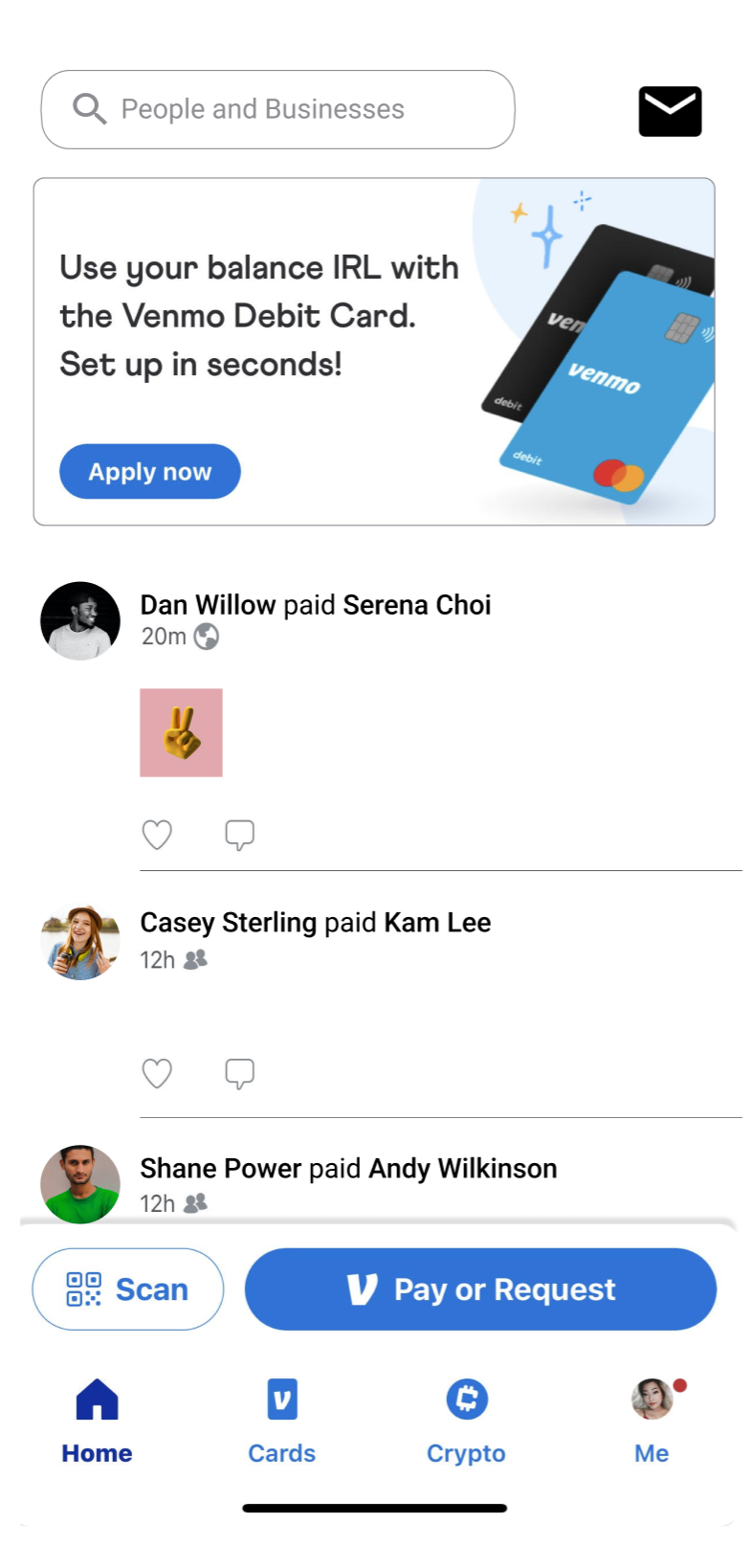
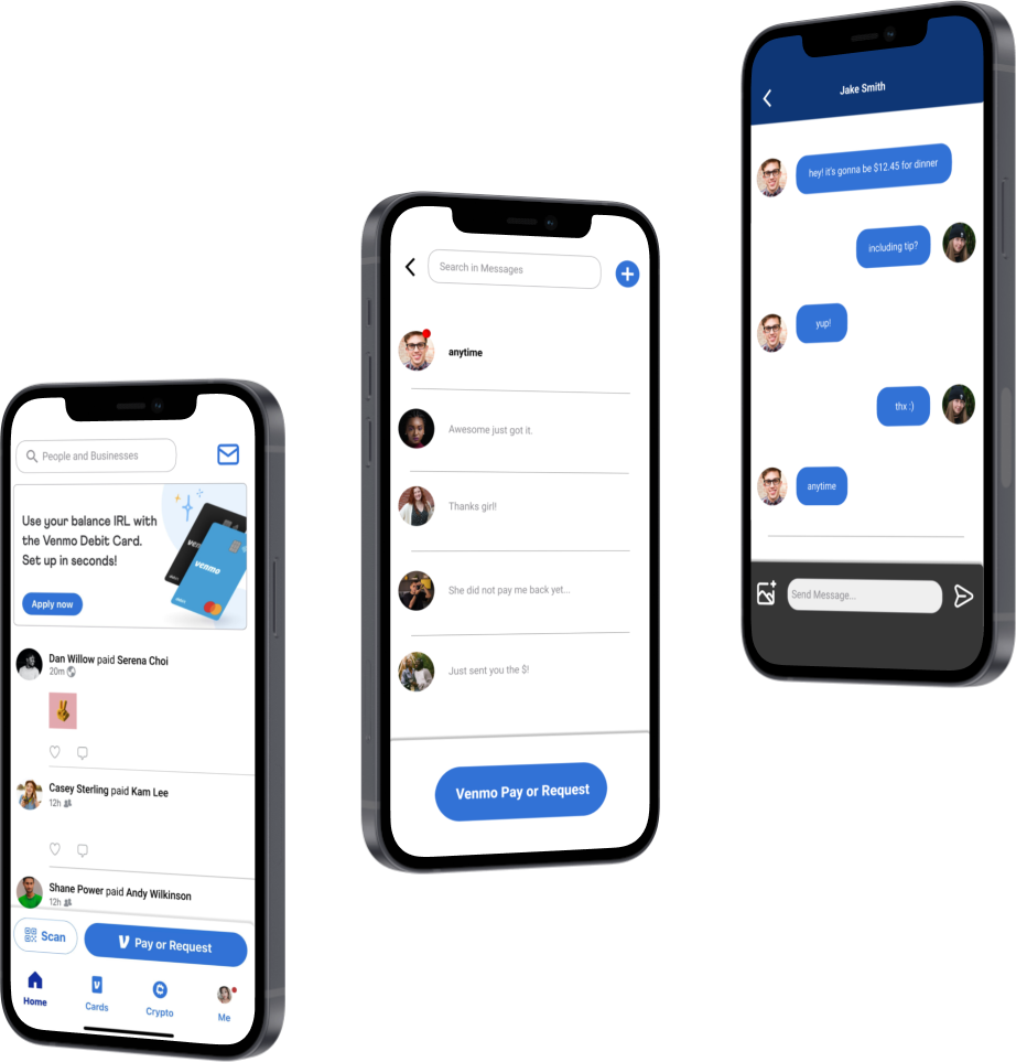
After working on the sketches, I carefully imitated what the Venmo app looks like in its feed, while also adding in the messaging feature. On the top right corner of the feed, you can see that the mail icon is placed in order to go through messages or even send one. I also added in a Venmo Pay or Request button on the bottom of the messages as well. This is there I will get my feedback from the users, so I can incorporate the edits into my hi-fi prototype.
AFFINITY MAP
To ensure the organization and structure in this process, I created an affinity map to keep track of the feedback I have received from the users. And according to the users, it seems like the new feature still fit in with Venmo’s layout, and that they would like more color to fit the theme some more. They also seemed to have enjoyed this feature, as they claimed would most likely be used for payments since they do not go on Venmo as often as other social media apps (which means this is on the path to working the way I would like it to).
Participant 1: 21yo, Female
Participant 2: 27yo, Male
Participant 3: 19yo, Male
BEFORE
AFTER
Finally, here is the end result! This time the users (after asking for their feedback once again,) were happy with the final product.
You can especially see how the color I applied to the icons definitely bridged everything together.
Although my concerns about not creating this app into a social media app are still existent, it seemed that the users said they only go on social media when there are news, photos, updates, etc. going on, which Venmo does not have much have besides payments in its feed.
It seems like this may be a feature that would be incredibly helpful to users, frequent or not, as this does help keep track of confirming who this person is by interacting with them along with sending reminders as well, aside from the automatic reminders Venmo sends occasionally.
HI-FIDELITY PROTOTYPE
The changes I’ve made with the color correction and changing some icons made a world of a difference! After showing the users, they repeatedly commented that it looks like it is a feature that is truly part of the Venmo app. This definitely opened my eyes to how much even the slightest bit of change could make as it came out better than I had expected, and I can see a potential in this feature being more useful than I thought it would be at the beginning of this project.


