HappiHeart: End-to-End Application
Problem
21% of US adults experienced mental illness in 2020 (52.9 million people; 1 in 5 adults). 5.6% of U.S. adults experienced mental illness in 2020 (14.2 million people; 1 in 20 adults). The COVID-19 pandemic has caused a lot of impact for the U.S., not even counting the other parts of the world. Suicide is still one of the leading causes (2nd leading cause) of death among people aged 10-34. It is incredibly difficult for people to have access to resources because of a multitude of reasons (finance, time, location/environment, cultural beliefs, etc.). And to those with mental illnesses or mental health concerns, it can be overwhelming to complete even the simplest of tasks. Self-care becomes a chore, and especially when one has no direction or structure for how to cope and make things easier throughout the day.
Background
HappiHeart is meant to be a starter self-care app, helping users who are either in therapy or not in therapy. This is made for any user, whether it be they are in therapy, not in therapy, have mental illness or not, or those looking for some type of structure in their lives. It will help teach how to be present which would in turn help soothe the nervous system or start their day ready to face anything. It is interactive and it will also give users a more tangible way of seeing their efforts.
GOAL
I want to make sure that I will provide a consistent, simplistic mental health app in order to not overwhelm users without consequences that may hinder them from viewing this app as effortless. This is to help keep users accountable and practice mindfulness.
COMPETITIVE ANALYSIS
I decided to come up with this Competitive Analysis in order to weigh the pros and cons of these apps. 3/4 of them were mental health apps, while the other was mainly a popular horoscope app many of the younger generations use (Millennials, GenZ, etc.).
These are typically either advertised commonly on social media (Instagram, TikTok, Facebook).
Tangerine: Mental health app that keeps you accountable with tasks
Finch: Mental health app that involves you taking care of a bird (ex. the frequency of water you drink keeps the bird alive)
Headspace: A meditation app that also comes with other features involving upgrading your well being.
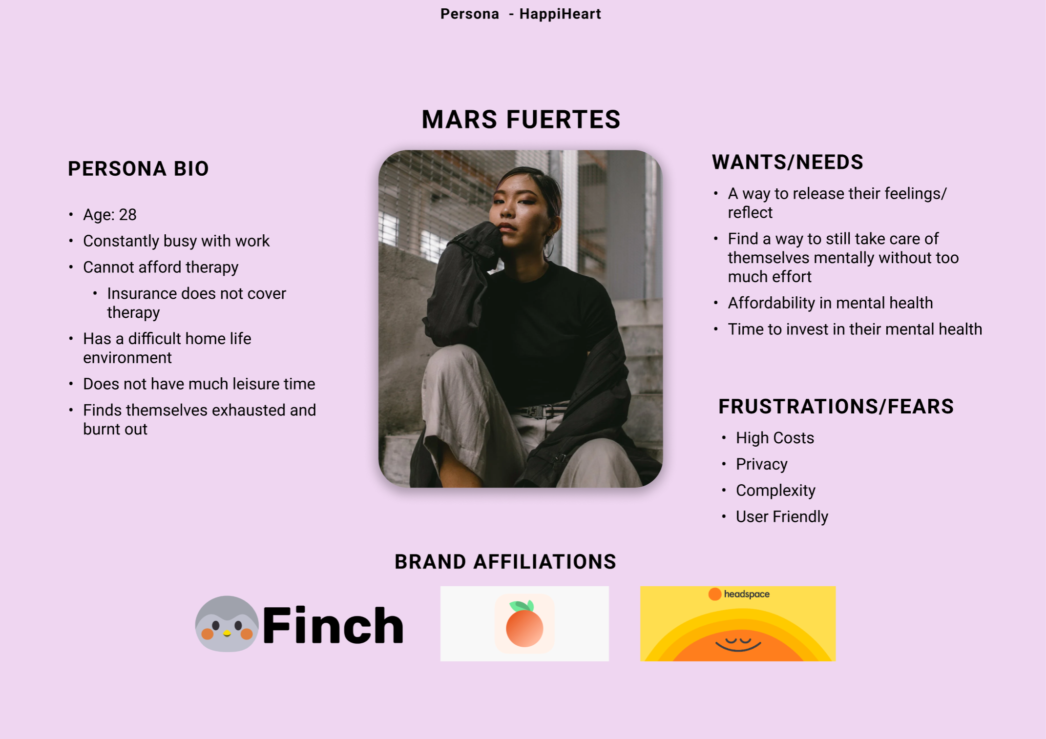
USER PERSONA: Mars Fuertes
I have created a user persona based on the collective of participants that I have asked for a regarding their occupation and their home life/difficulties they have with their mental health, especially since the pandemic (most who will not be taking part of the user testing, however, I felt like using this information and putting it into one persona would benefit this app greatly). 20% of these people were coming out of college and going into the work force, 60% working full time jobs, and 20% were not working for numerous reasons.
A lot of these participants are struggling in one or more areas in particular, including work, school, home life, and the lack of free-time/social activities.
WIREFRAMES
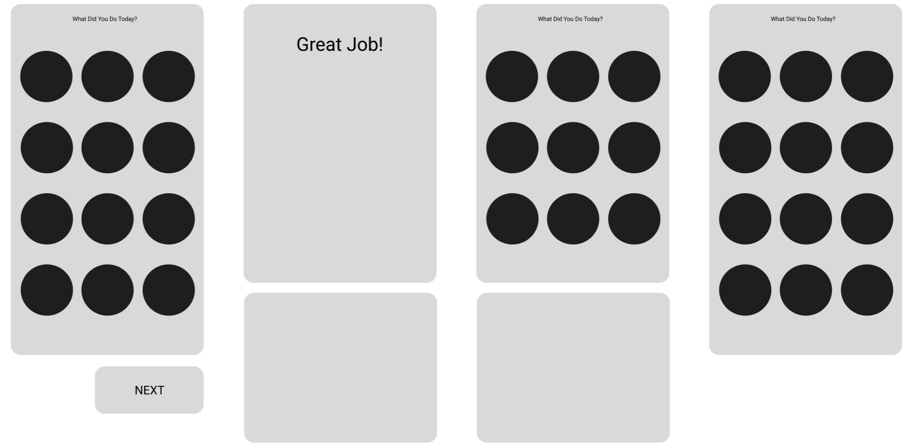
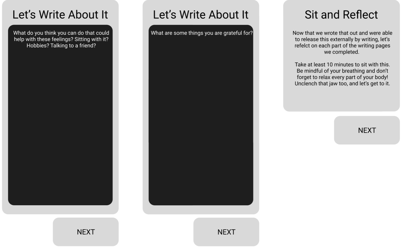
After playing around with Figma (I do prefer to use Figma sometimes more than sketching, since it is more legible), I created some draft wireframes. How it will look like is that I plan to have a home page, then I will create some icons of certain actions that are more day-to-day to make it friendlier. Something that was on my mind as well was that shaping and simple format/placement would be beneficial and effective for users. (ex. Circles will contain icons/images to make it appealing to the eye; images tend to be more engaging than identifying subjects as words). I wanted to genuinely make sure the users will not have a difficult time using this app, especially since users’ bandwidth will be a huge factor in this!
UI BRAND KIT
I moved on to creating a UI Brand Kit. To be quite honest, it was definitely more tricky coming up with something that seems playful and colorful without it being tacky. I wanted this to capture the essence of this app, as well as have it subconsciously uplift users’ moods. I also took into account how this might look on a user’s phone, making sure to make this bright and used to the most extent.
This UI Brand Kit provides cool toned colors (one of the main colors being purple, very much close to the shade of blue). Users in this study as well as users in general are prone to having a more relaxed state and feeling safe according to studies and apps that also follow this guideline: blue. Instead of creating something blue and to have it stand out more than apps on users'‘ phones such as Twitter, Facebook, etc. this color palette will provide a way to make the app easier to locate while also not being the typical blue one may see on other apps. Color can affect the brain, which is why this palette is quite colorful. I also incorporated colorful bubbles as well to keep things lighthearted, nothing daunting.
HI-FI PROTOTYPE: VERSION 1
After combining both the UI Brand Kit along with the wireframes, below shows what I have before the mockup. During this time, I carefully designed different icons that I believe would make HappiHeart endearing. This definitely set the tone even more! The navigation should be simple enough as well. This is what I used for user testers to navigate on their own through a video call with each of the 3 of them. Their first initial reactions with how it looked surface level was exactly what I wanted, which was fantastic! Common words used for this app as a first impression before starting to navigate their way was “cute”, “bubbly”, and “colorful”
AFFINITY MAP
After going through the process of the user testing, I asked for their feedback on it. Specifically, I had 3 people be user testers. It seems that the navigation was a success, as well as the design aspect of the app. As I talked it through with them, they said the app was well done, just a couple changes need to be made that would not be difficult to incorporate as they are more small adjustments. The biggest part for them that I found was that they said it was not overwhelming and they enjoyed doing it- it made them feel accomplished while also not having that freeing moment knowing that it won’t affect how they look at themselves, especially since the app does make it clear that expectations will not always be the same everyday. That is something that I believe is incredibly important to incorporate in this app!
Person 1: 23yo, Male, College student (majoring in Psychology)/part-time job
Person 2: 25yo, Female, Healthcare Industry full-time
Person 3: 30yo, Female, Graduate School, full-time job
BEFORE
AFTER
After seeing the changes made, I felt like it did pull everything together. From incorporating highlight to the stop sign CTA to let a user visually show if they tapped on it, darkening for stark contrast of CTA, and adding in the drop shadow to make the CTA less flat has made a huge difference! The user testers were quite content with these changes made.
HI-FI PROTOTYPE: FINAL VERSION
CONCLUSION
Taking a look from the start to finish has opened my eyes to how much it takes to create a working app. Even the slightest of details are not to be overlook and there can always be improvements made that can turn a product more cohesive. I enjoyed this process and look forward to continue researching about end-to-end applications!


